Challenge
Crafting a modern, localized brand
Western Health’s previous digital presence felt outdated, with generic system fonts and an inconsistent visual system that lacked personality. The new brand expression needed to properly reflect the organization’s community-driven mission and resonate with its local audience.
Solution
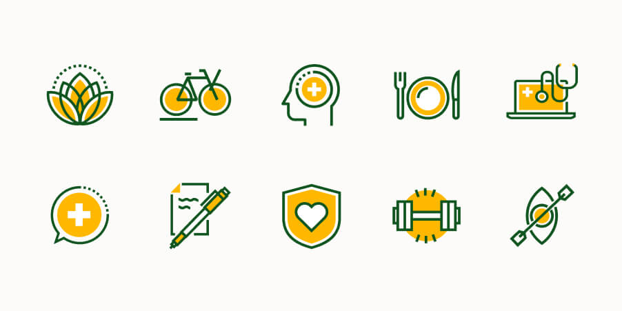
The visual identity evolved to better infuse warmth, credibility, and a sense of regionality into the brand. Updated typography, a more intentional use of color, and a cohesive system of icons, shapes, and photography work together to create a modern, distinct experience.
Challenge
Designing for diverse audiences
Western Health serves several distinct user groups: individuals and families, providers, brokers, and employers — each with unique motivations and needs. The new website needed to clearly guide these audiences to the tools and information most relevant to them, without overwhelming them or creating a one-size-fits-all experience.
Solution
Personalized navigations and homepages were designed for each audience, enabling users to self-select their role and access content tailored to their needs. This allowed primary actions, messaging, and tools to be surfaced based on audience type, creating an intuitive and efficient experience. Colorways were strategically assigned to represent each audience, reinforcing clarity and orientation throughout the portal experience while remaining visually cohesive.
Challenge
Empowering users through self-service
Navigating health decisions can be complex, and Western Health's previous suite of self-service tools were cumbersome and confusing. It was important to reduce the friction that prevented users from completing essential actions with ease — including finding a provider, requesting a quote, estimating costs, and applying for a plan.
Solution
The self-service tools were redesigned with a focus on clarity, hierarchy, and usability. Multi-step flows for finding providers, service area searches, cost estimators, and plan applications were optimized to make each step easy to follow. Streamlined layouts and clear progress indicators guide users through each tool, helping them understand services and costs with confidence.
Challenge
Simplifying complexity within the portal
The previous portal experience contained scattered content and was difficult to navigate. Critical information like plan details, claims, and invoices was hard for users to access. A more structured, intuitive experience was needed to support users in completing their tasks efficiently.
Solution
The portal was revamped with a sticky side navigation and clearly defined sections to organize content more logically. Pages were redesigned to better support large tables and data-heavy elements, using improved hierarchy and spacing to make information easier to scan and understand. Streamlined layouts and a consistent structure guide users through the portal with confidence and efficiency.